
Our expertise
-
We build a visual direction around your business: colours, typography, imagery, the rhythm of each page.
Then we build it faithfully, screen by screen, on desktop and mobile. Subtle transitions, easy-to-tap buttons, text that reads effortlessly.
A site people recognise. And want to explore.
Pixel perfect
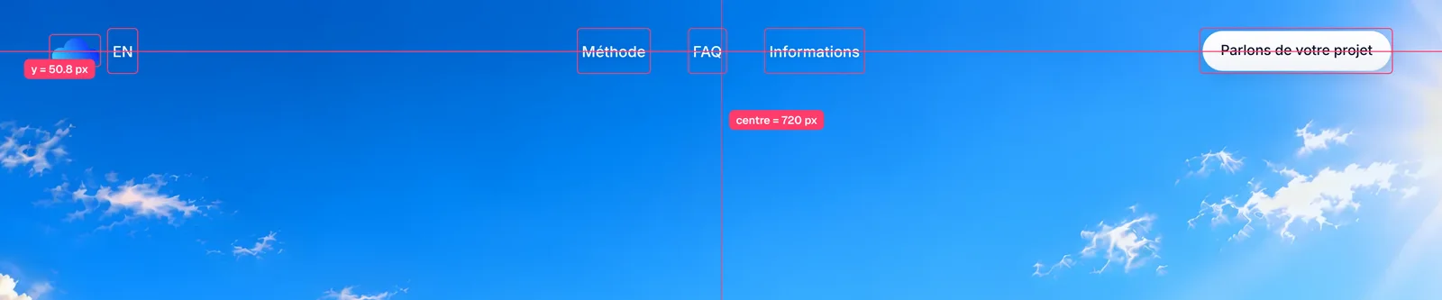
Every element is measured. Here, this site’s header: logo, links and button share exactly the same line, and the navigation is centred to the pixel.
Everything in its place
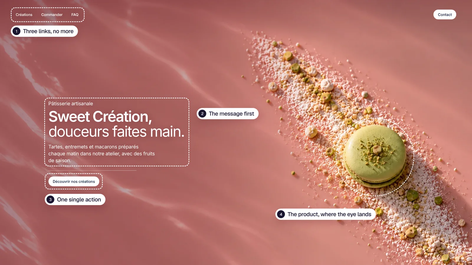
A homepage is read in a few seconds. Nothing on it is placed by chance.
Liquid glass
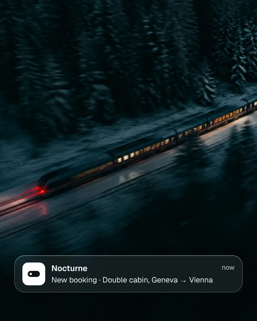
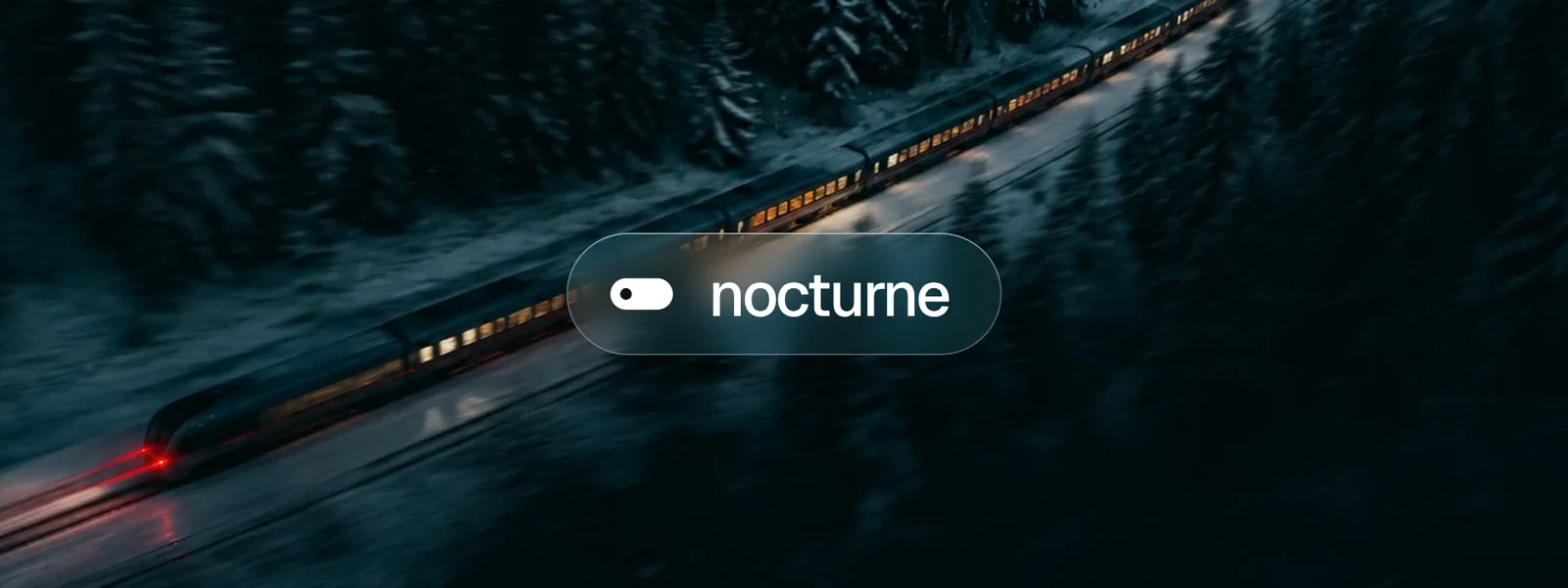
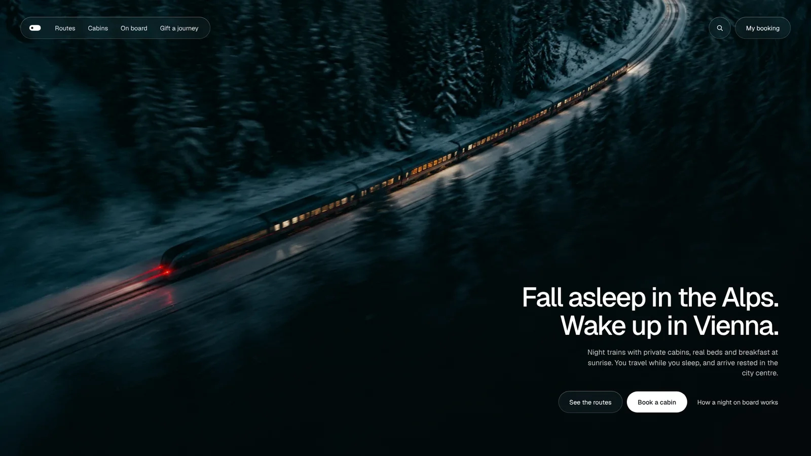
On a night photo, a solid menu would punch a black hole in the image. In glass, it lets the train, the lights and the snow show through, softly blurred. The photo stays whole, and the menu stays readable whatever is underneath.
It is not there just to look nice. We keep it for sites where the image carries the whole message, tune the blur and transparency case by case, and plan a simple fallback for browsers that do not support it.
-
We organise your pages, your content and the path that leads to contact. Simple labels, a clear hierarchy, a next step that is always visible.
The structure is laid out in mockups and approved with you before development. Nothing is built before it is understood.
A journey that needs no instructions.
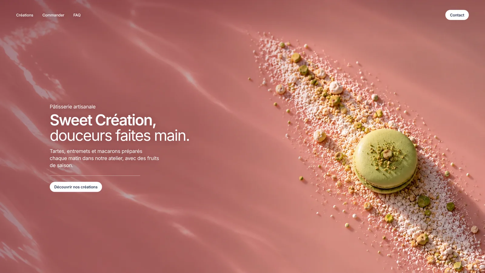
Appetite first
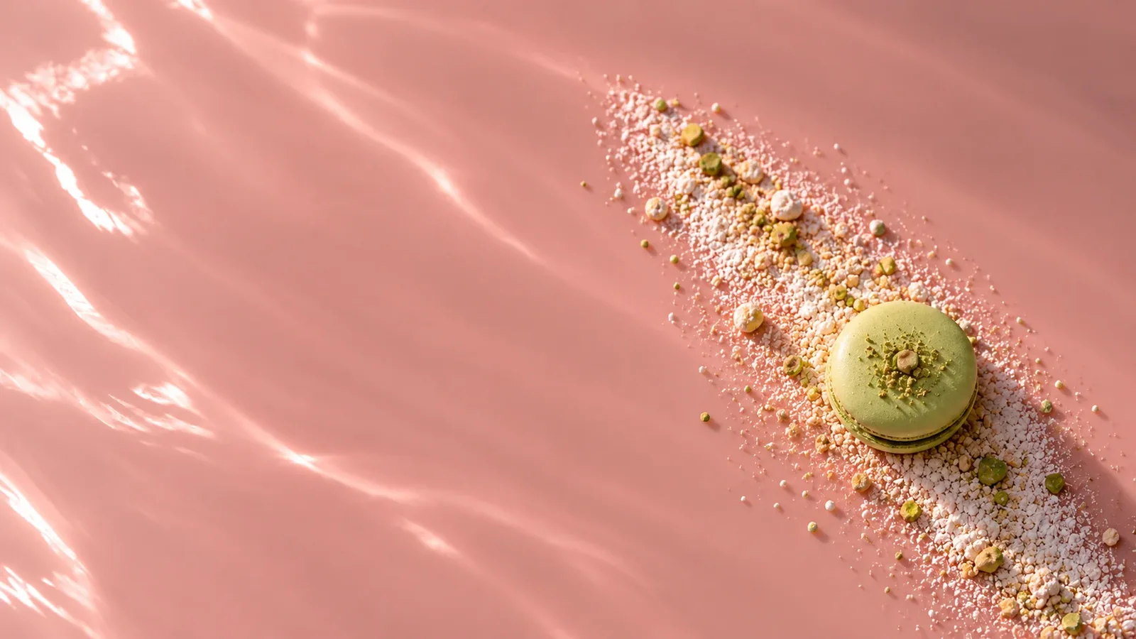
A pastry is chosen with the eyes. Before reading a word, you should already be hungry.
One image, one line, one button. Visitors know where to click without thinking.
The landscape as a shop window
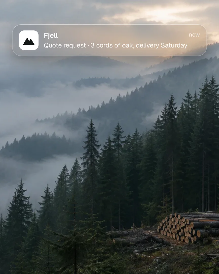
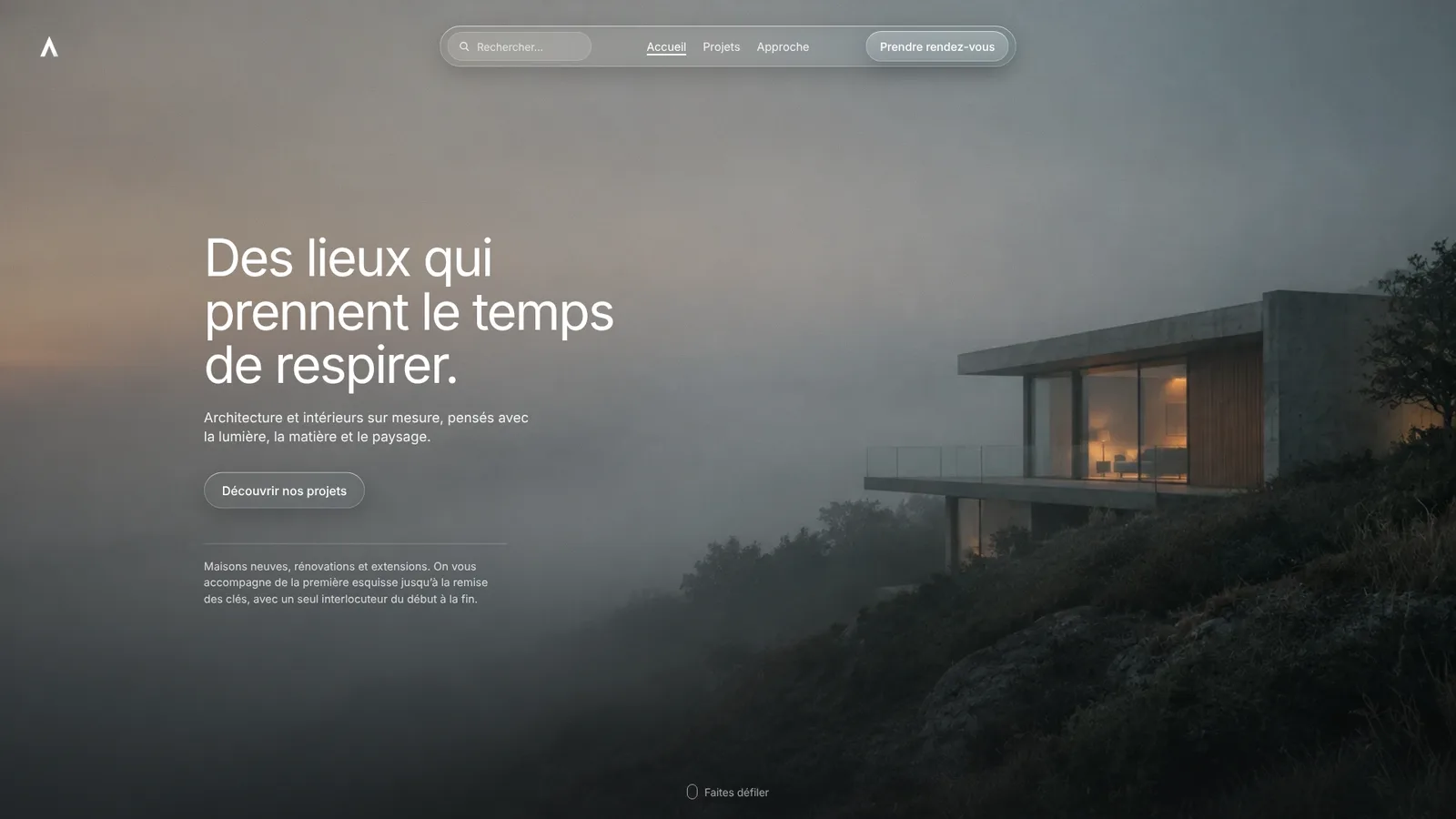
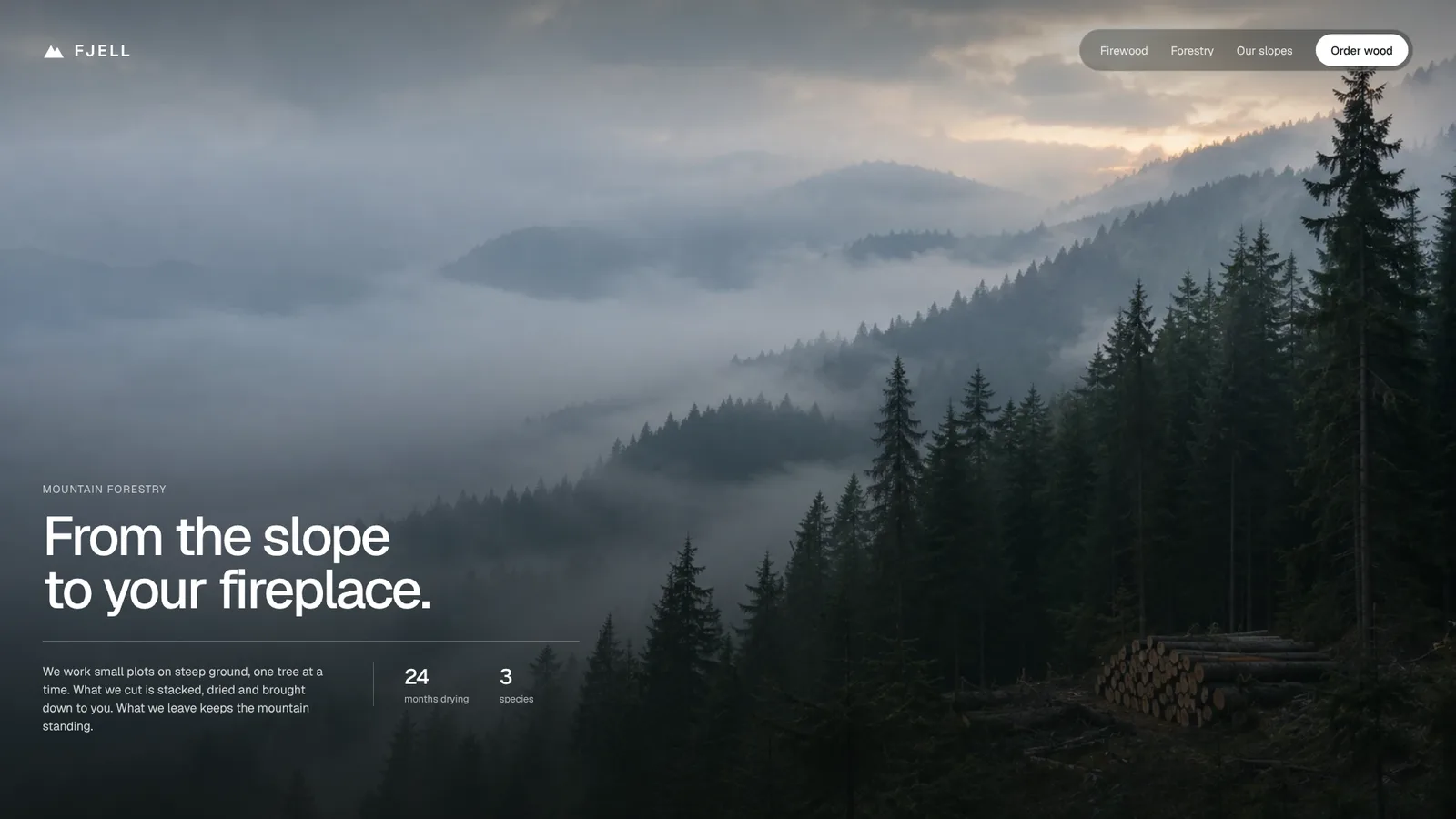
An architect’s house in the mist, a mountain forest at dawn. Two trades that sell a place before they sell a service.
In both, the photo does the work. The text steps back: few words, one action.
Night as the setting
A night train sells a promise: fall asleep here, wake up somewhere else. A dark photo, a single red light, and the text tucked into the calmest corner so the eye follows the train all the way to the buttons.
Behind the image, we take care of what you don’t see: booking in a few steps, timetables readable at a glance, a page that stays fast even on a station platform. A site that makes people want it, then lets them act without friction.
-
We prepare clear, well-structured pages: titles, descriptions and content written to be read well by search engines.
Light pages that load fast, because a mobile visitor has little patience. And advice on where to present your business beyond your site.
Be found. Then be chosen.
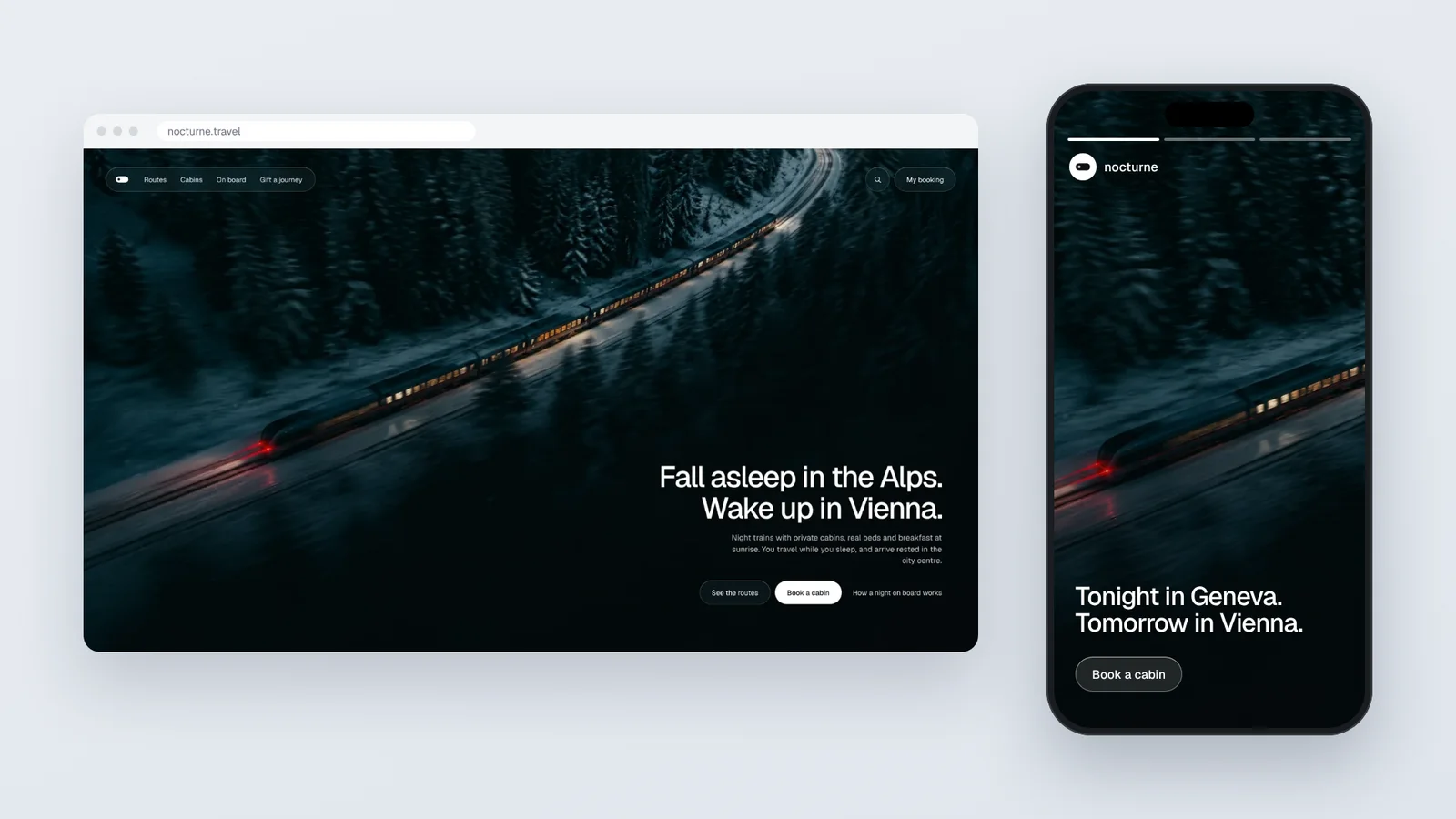
night train alpsnocturne.travelNocturne · Night trains through the AlpsPrivate cabins, real beds, breakfast at sunrise.One brand, many screens
We don’t stop at the website. The same world carries over to stories, posts and your Google profile, with the same logo, the same words, the same images.
From one screen to the next, people recognise you before they read you. That is what turns a visit into a memory, then into a client.
What it changes
A well ranked site keeps working in the evening, at the weekend, while you are on holiday. Requests come in without you chasing them.
That is the real point of visibility: not views, but bookings, quotes and calls. People who arrive already convinced.